

You've pored over buyer personas and invested in understanding your audience. You've concocted a compelling offer, a valuable piece of content, a meaningful event. You've got what they want. You've got what they need. You're a marketing genius.
The goal of any inbound marketing campaign is to convert your audience, your contacts, your leads, your prospects, into paying customers and raving fans of your business. And when you create an offer or an event, you are engaging that audience and showing them you've got what it takes to earn their business. You are building a relationship and earning trust and proving that your company can best serve their needs or that your product will solve their problems.
The best part is that people will just know you've done all that work and will just find your offer.
Oh, wait. That's not right.
This is where your campaign collateral comes in. These assets are the big flashing arrows pointing people to your offer. They are placed where your audience already spends time online and create a path to your offer.
Below, we've listed a few of the major assets associated with pretty much every inbound marketing campaign and provided best practices to increase conversions. Keep these in mind when creating collateral for your next campaign.
CALL-TO-ACTION (CTA)
For many people who will go on to engage with your offer, this is the beginning of the path. Your CTA points to your landing page. It is one of the flashiest arrows in your campaign. It can be a button or a graphic, and you can place it on social media, in your blog posts and web pages, anywhere your audience is spending time and signaling that they may want more of what you have to offer.
Though it may be one of the first pieces of collateral your audience sees, we recommend making it last, as the CTA largely depends on the content of your landing page and thank you page.
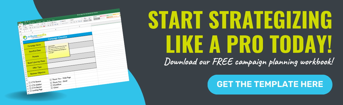
Campaign consistency starts here. You want the same look and feel for your CTA and throughout your landing page and thank you page. If a user clicks on your CTA and ends up on a page that looks nothing like the CTA they clicked on, they’re likely to leave the page without doing anything because they’ll think they ended up in the wrong place. Here's an example of a solid CTA (Oh, and what do you know, it is totally relevant to the content you are reading right now!):
Landing Pages
The whole purpose of a landing page is to "sell" your offer. Even if the offer is actually free, your goal is to collect contact information of the people interested in your business, and that information is currency. This type of offer is known as “gated content.” A user fills out a form to get your content delivered to their inbox. If your offer is an event, the form serves as kind of an RSVP and you can send your guest list updates leading to the event. Here are some simple best practices to remember when creating landing pages:
- Remove Navigation: Access to the main menu of the site can distract the user and make it too easy for them to navigate away from the page before doing what they've come to the page to do.
- Create a Compelling Title: You may have to do some A/B testing on this to determine which title works best for you.
- Be Consistent: Make sure the image on the page matches the CTA that brought users to that page. You don't want to risk the user thinking they've taken a wrong turn somewhere.
- Tell Visitors the Benefit: Try to distill this down to a few bullet points on why your offer will enrich their lives. That is the only way they'll be willing to fill out a form to claim your offer.
- Keep the Form Simple: The more energy a form requires, the fewer people will take the time to fill it out. This is where marketing software like HubSpot comes in handy; their forms tool has a ton of cool features. Anytime you can auto-populate form fields with info you already have or not even display the fields they've filled out on your site before, the easier it is for someone to take you up on your offer.
The form is the most critical component in landing pages, so make sure you take the time to do it right!
Thank You Pages
The primary purpose is to make good on your promises from the landing page. In other words: hand over the goods! The secondary purpose is to direct the visitor to anything else they my find valuable. Here are some tips for creating Landing Pages:
- Navigation is Optional: Typically you’ll want to include it. Now that they've got what they requested, they should feel free to look around your site for anything else they might like. The time to consider leaving off navigation is if you want to keep the visitor on a particular path and want to use another call-to-action to lead them to the next step.
- Reiterate the Value: Be brief, but remind the user how they'll benefit from this offer. After all, they haven't opened it up yet, they could still abandon the conversion path.
- Consistency Again: They should feel like they've been on the same path this whole time. Images should match the CTA and landing page.
- Pay Up: Deliver the what they signed up for. If it is a content offer, provide it either right there on the page or as a link to download. You should also send a follow up email with the content in case someone is not on the device they would like to download to (such as a phone or a public computer). If it's not content, provide some confirmation of the next steps and what to expect.
- Make it Shareable: Make sure your social share icons link to the landing page, NOT the thank you page. This gives you the opportunity to lead others through the gate for your offer.
What Else?
Beyond your CTAs, landing pages and thank you pages, there are dozens of other campaign assets to consider. Remember how we said that the CTA is one of the first pieces of your campaign the visitor interacts with? Well that is a little misleading. It is the first in the controlled path from the CTA to landing page to thank you page. But where does the CTA live? In order for someone to see your CTA, they have to have found you in some other way. That can include:
- Blog Posts
- Website Pages
- Social Media Posts
- Marketing Emails
- Flyers at Events
- Digital Ads
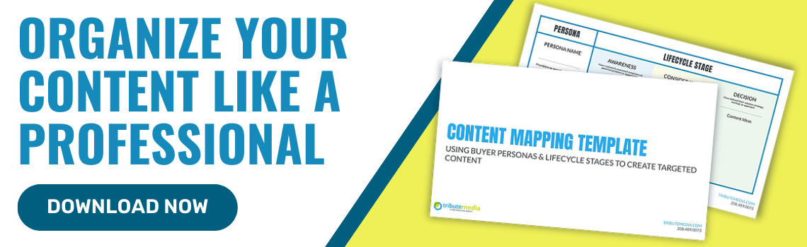
Think about what you are reading now. It is a blog post about many of the elements that need to be managed as a part of an inbound marketing campaign. And you saw this CTA for a tool that helps you do just that:
Coincidence?
Never.
Are You on Track?
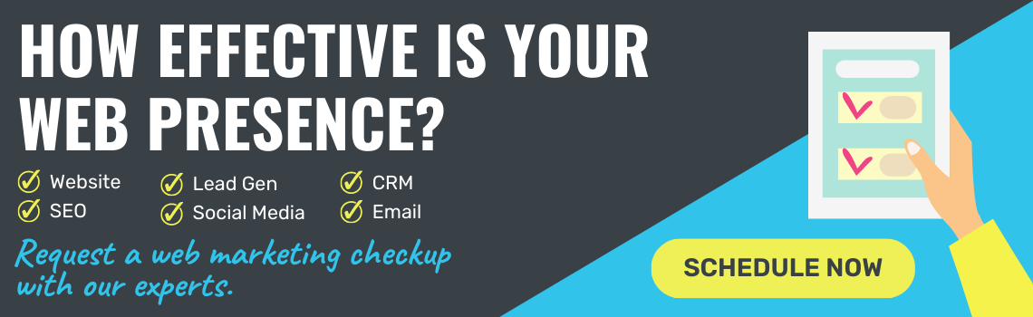
Knowing all of this, now is a great time to honestly ask yourself if you’re on track. Are your CTAs and landing pages converting visitors into leads? Are your thank you pages followed up with steps to nurture those leads to become customers? Is what you are offering what people are actually looking for, and does it align with your goals? If you need more than a workbook, if you need someone to talk strategy with, you may want to schedule a web marketing checkup with one of our experts.
Hold on--we have a CTA for that:

Written by Lindsey Bowshier
Lindsey is the President of Tribute Media. Her degree is in English and Communication with an emphasis in Journalism, her background is in copywriting and content marketing, and she's had pretty much every job at Tribute Media since she joined the agency in 2014. Outside of work, Lindsey participates in a "super-cool-not-at-all-nerdy" writing group. Her favorite writer is Dorothy Parker.

